Details - Portfolio
Logo Folio - 5 Sens Advertising
Shared
26/11/2024
Share on :
Logo Folio - 5 Sens Advertising
Approach and Creative Strategy
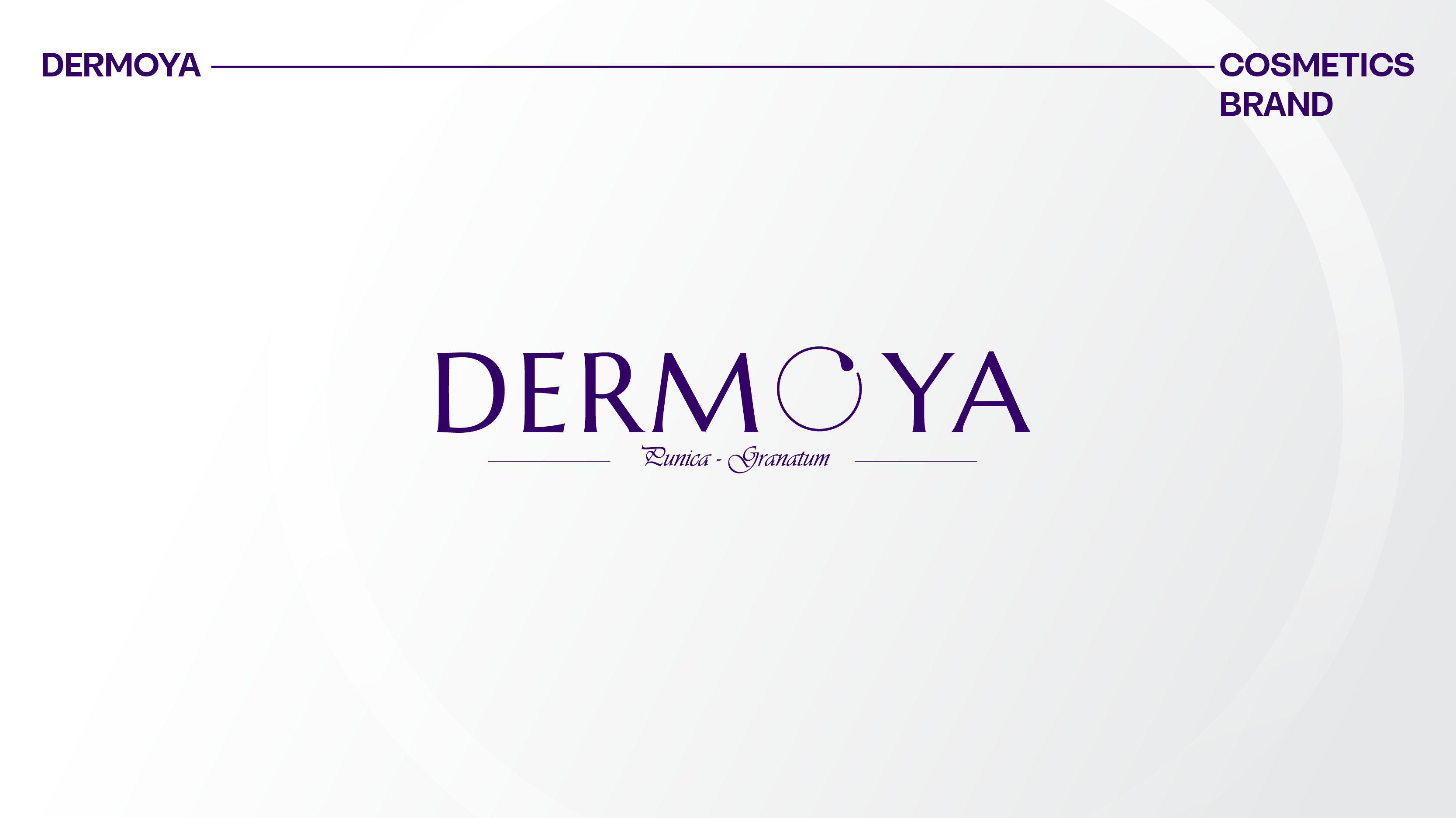
Art direction:
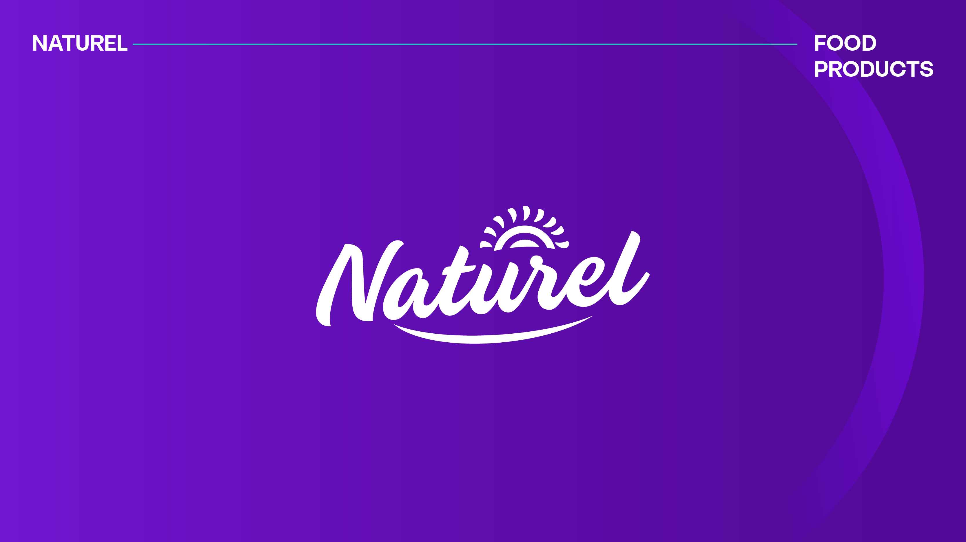
Naturel’s visual identity is directly inspired by the codes of nature. Graphic choices were oriented toward a soft, clean, and balanced universe to convey a sense of freshness and authenticity. Every visual element was designed to evoke ingredient quality and product purity.
Color palette:
The color palette is based on natural, soothing tones that recall essential elements of nature. These colors were selected to reinforce emotion, serenity, and trust, while ensuring strong visual consistency across all materials.
Typography:
Modern, elegant, and highly legible typefaces were chosen to add a contemporary touch while preserving a human and organic dimension. They support the balance between modernity and naturalness, a core pillar of Naturel’s positioning.
Graphic elements and visual signatures:
Graphic elements draw on organic shapes, fluid lines, and subtle textures that evoke life and nature. These elements enrich the visual universe without overloading it, reinforcing the brand’s premium and authentic character.
Through this visual identity, 5 Sens Advertising provided Naturel with a coherent, sensory, and meaningful graphic universe—capable of translating its values into strong, lasting visuals and anchoring the brand in the minds of its audience.