Details - Portfolio
Branding - Dermoya
Shared
22/11/2024
Share on :
Branding - Dermoya
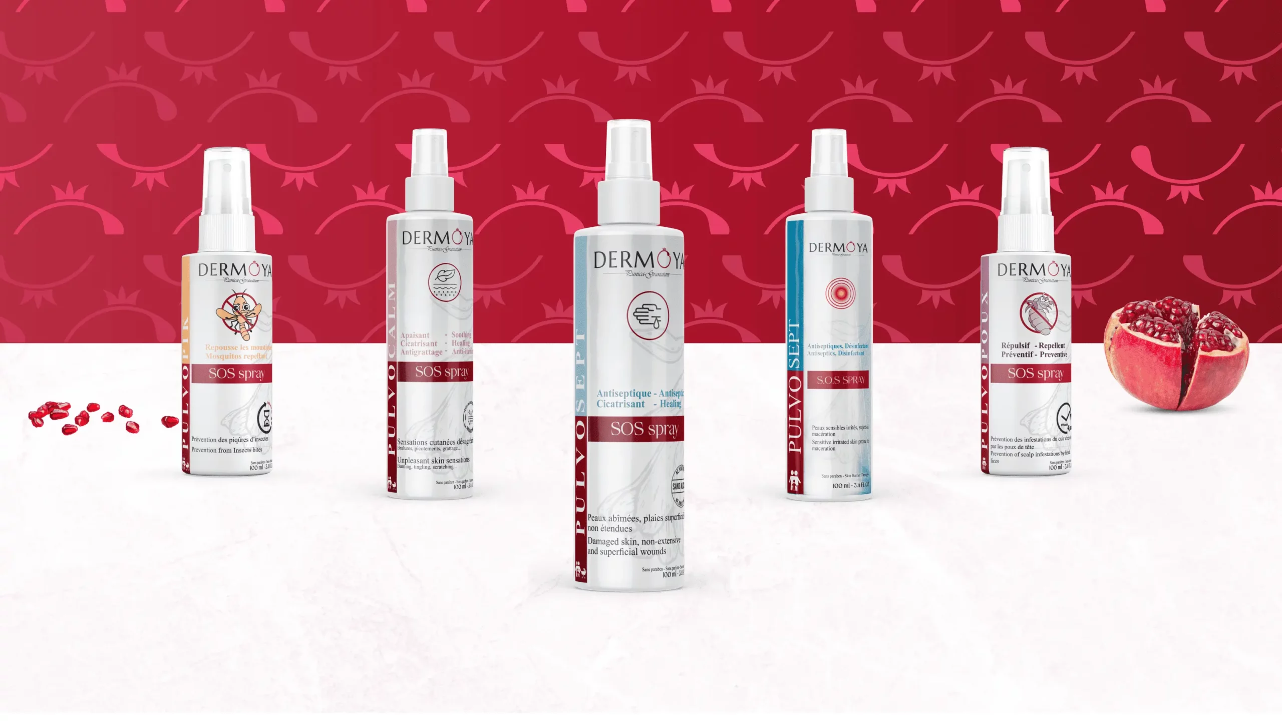
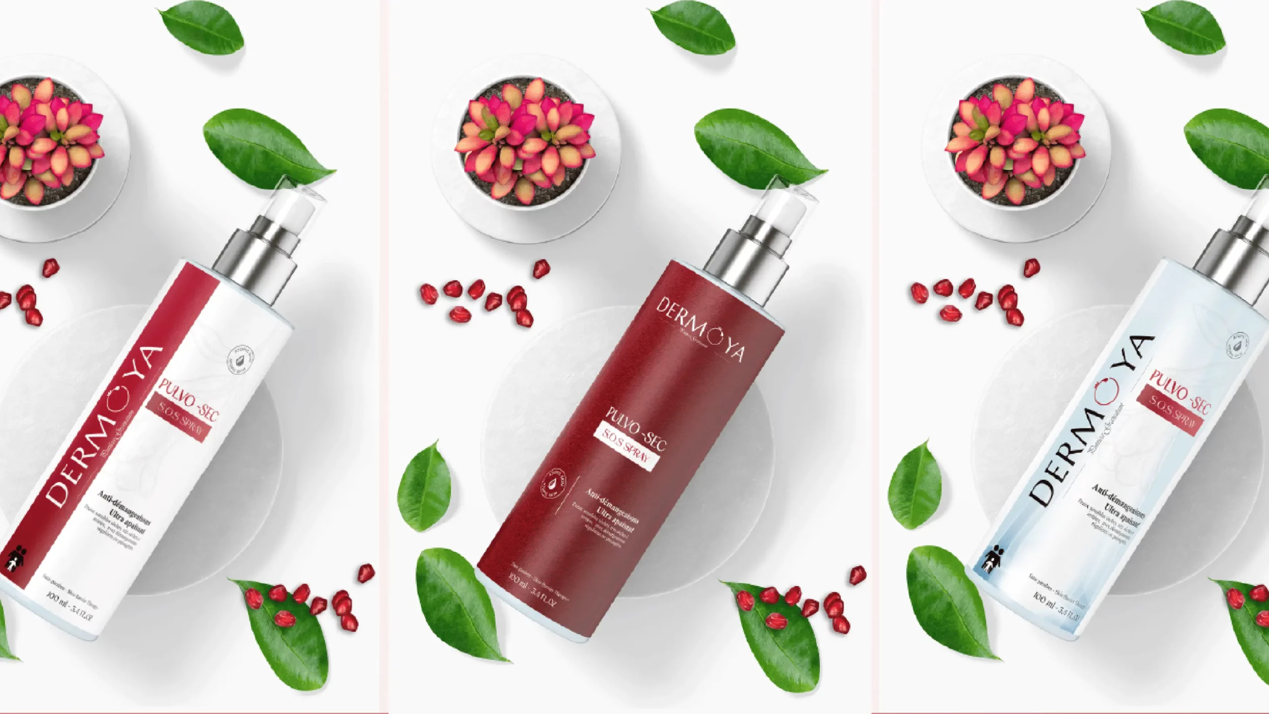
At 5 Sens Advertising, we supported Dermoya—a brand specialized in dermo-cosmetic skincare—in creating an elegant, consistent, and distinctive visual identity.
The objective was to develop branding that reflects Dermoya’s scientific expertise while inspiring trust, effectiveness, and well-being among its target audience.
A visual identity designed for the dermo-cosmetic universe:
Our approach began with an in-depth analysis of Dermoya’s DNA, positioning, and audience. This strategic phase enabled us to define an art direction combining rigor, purity, and modernity, fully aligned with the codes of the dermo-cosmetic sector.
The color palette is built around soft, refined tones, evoking purity, safety, and care. These visual choices help establish immediate consumer trust—an essential factor in the skincare market.
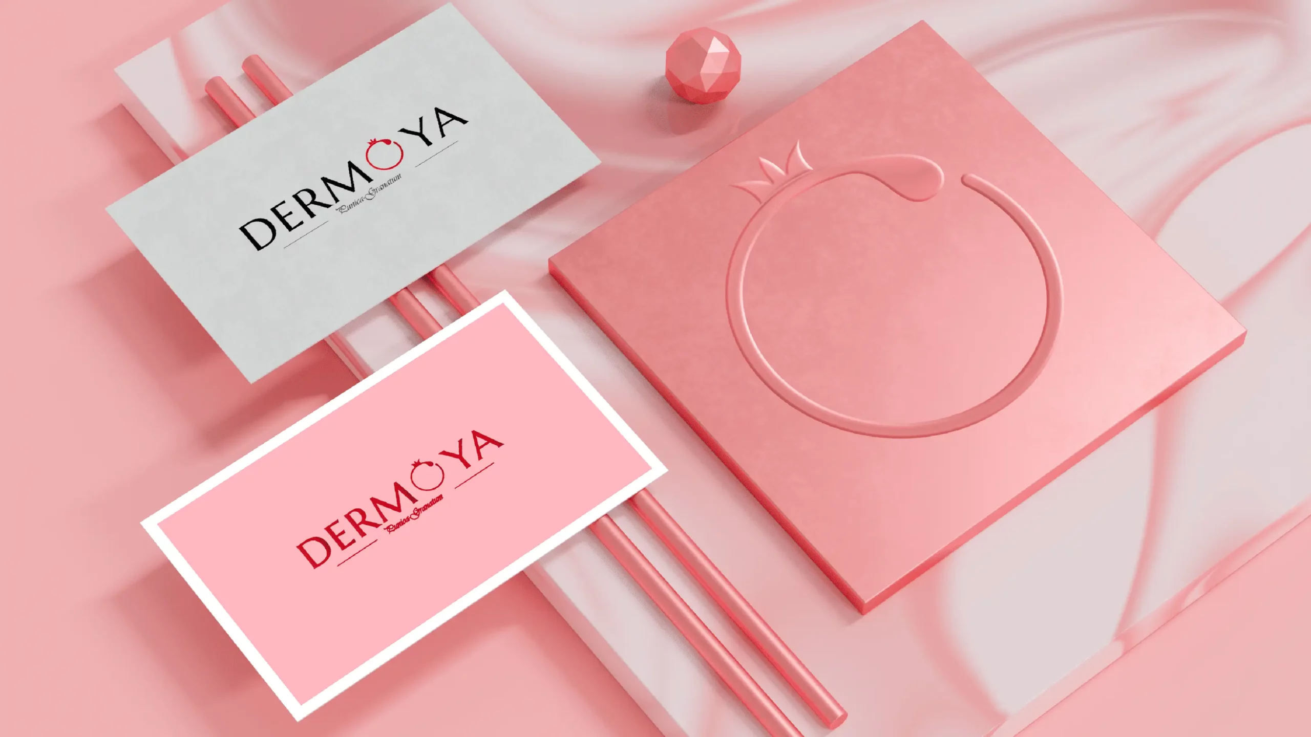
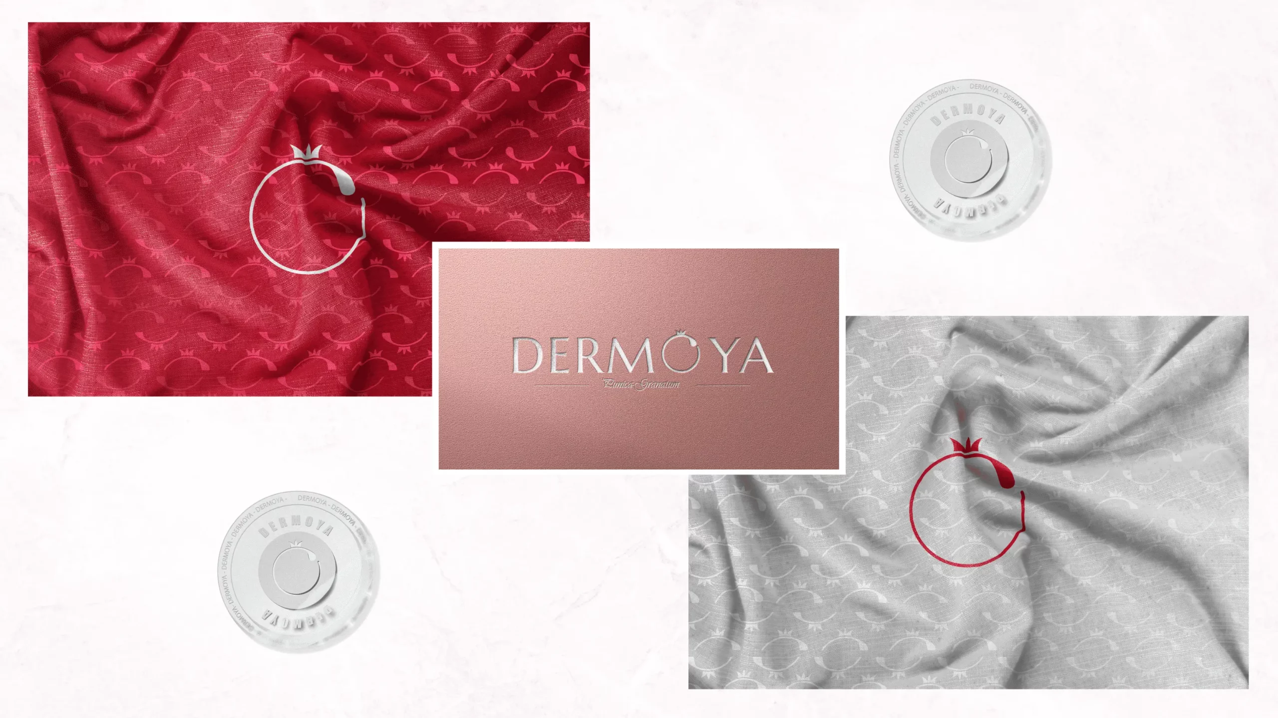
Brand Variations and Consistency:
Dermoya’s visual identity was designed to be seamlessly adaptable across all communication materials, ensuring strong consistency at every touchpoint.
An identity that supports the brand’s positioning:
Through this project, 5 Sens Advertising developed a strategic visual identity for Dermoya, aligned with the standards of the dermo-cosmetic sector and the brand’s ambitions. This branding enables Dermoya to assert its positioning, highlight its expertise, and stand out sustainably in its market.