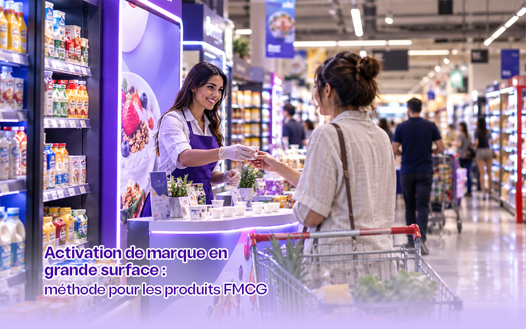










FMCG packaging is not judged on the marketing director's screen, blown up large and under flattering lighting. It is judged from six feet away, behind the counter of a grocery store in Kairouan, wedged between twelve competitors. There, it has three seconds. Either it is recognized, or it does not exist.
In consumer goods, the pack is the only medium the brand fully controls at the moment of purchase. Yet many packs are still designed like posters: attractive and packed with messages, but hard to spot. Here is how to design FMCG packaging that gets recognized at a glance, and how to test it before going to print.
In short. Here are three guidelines for a pack that wins on the shelf:
- Recognized before read: shoppers spot a color and a shape first, and only then a name.
- One second, one piece of information: brand first, variant second, benefit last.
- Test in real-world conditions: brief exposure, distance, low light and a cluttered shelf.
Why FMCG Packaging Has Only Three Seconds to Win
Consumer goods purchases are fast and largely automatic. As early as 1990, Dickson and Sawyer observed in the Journal of Marketing that supermarket shoppers spend very little time on their choices. Many do not even check the price of the item they pick up. In other words, shoppers do not compare: they recognize.
This behavior matches what Daniel Kahneman calls System 1: fast, intuitive and effortless thinking. In front of a shelf, the brain does not read packs one by one. Instead, it looks for familiar cues and stops at the first one that matches its habits.
That is why the Ehrenberg-Bass Institute emphasizes a brand's physical availability and mental availability. On the shelf, the two come together on the pack. Effective FMCG packaging therefore does not set out to persuade first. Above all, it aims to be found, then to reassure shoppers about their usual choice.
The Tunisian Shelf: Two Channels, Two Challenges
In Tunisia, FMCG packaging has to work in two very different environments. According to estimates published by WMC in 2019, the country had more than 250,000 traditional grocery stores. By contrast, modern retail accounted for only about 22% of retail trade at the time. These figures have changed since then, but the balance remains the same: neighborhood stores still dominate.
As a result, your pack faces two distinct challenges:
- The neighborhood grocery store: the product often sits behind the counter, seen from a distance, sometimes in dim lighting. It is also frequently asked for by name.
- The supermarket: shoppers serve themselves, facing shelves crowded with SKUs and promotions.
| Criterion | Neighborhood grocery store | Supermarkets and hypermarkets |
|---|---|---|
| Viewing distance | 5 to 10 feet, behind the counter | 2 to 5 feet, facing the shelf |
| Lighting | Variable, often dim | Even and bright |
| Mode de choix | Asked for by name, then pointed at | Self-service, quick comparison |
| Decisive cue | Color and silhouette | Color, logo and variant |
| Main risk | Being confused with a same-color competitor | Dilution dans un bloc de références |
In short, a pack that only passes the supermarket test misses out on most points of sale. To dig deeper into this topic, our article on strategies to boost your in-store sales covers the other in-store levers.
The Distinctive Assets of FMCG Packaging
Jenni Romaniuk, a researcher at the Ehrenberg-Bass Institute, uses the term distinctive assets for the elements that evoke a brand without its name. These can be a color, a shape, a character, a logo or a typeface. In her book Building Distinctive Brand Assets (2018), she proposes evaluating them on two criteria.
- Fame: what share of category buyers link the asset to your brand?
- Uniqueness: does it evoke only your brand, or your competitors too?
A well-known but shared asset does not help you. For example, a red used by three brands in the same category sets no one apart. Likewise, an original but unknown icon is not yet working for you. FMCG packaging should therefore rely on one or two assets that are both well known and unique to your brand.
| Distinctive asset | Strength on the shelf | Watch out for |
|---|---|---|
| Dominant color | Visible from far away, spotted first | Often shared across the category |
| Pack shape | Recognized even from the side or when stacked | Tooling and production costs |
| Logo and typeface | Explicitly signs off the brand | Illegible if too small or too thin |
| Character or mascot | Strong emotional pull, especially with families | Slow to build, requires consistency |
| Pattern or graphic device | Ties an entire product range together | Can be mistaken for mere decoration |
In practice, color and shape work at a distance, while the logo works up close. In the Tunisian market, where the distance from the counter matters, it is therefore often color and silhouette that make the difference.
The Three-Second Rule for Your FMCG Packaging
At 5 Sens Advertising, we organize the front of FMCG packaging according to a strict hierarchy. Each second of the shopper's glance must answer a single question.
Second One: Which Brand?
First, shoppers must identify the brand without reading. Distinctive assets therefore take up the most visible area, usually the top third. The brand block must stay the same from one variant to the next.
Second 2: Which Product?
Next, shoppers need to recognize the category and the variant: flavor, size, light version. A secondary color code or a product image works better than a long block of text. A range in which every variant looks the same pushes shoppers into buying the wrong product.
Second 3: Why This One?
Finally, only one benefit can appear: "richer in milk," "no added sugar," "family size." Beyond one message, the eye retains nothing. All other claims should therefore move to the back, the side panel or digital communication.
Clutter is the main enemy. Every claim added to the front of pack weakens the others. That is why the best pack is often the one from which the most elements have been removed.
Bilingual FMCG Packaging in Tunisia
In Tunisia, food labeling regulations require Arabic to be among the languages used, for both local and imported products. They also require certain mandatory information to be grouped in the same field of vision. As a result, the pack almost always carries two scripts.
The risk is then to duplicate everything and overload the front of pack. To avoid this, we apply three principles:
- One dominant script for the brand, chosen according to the primary target audience, with the other kept secondary.
- An Arabic typeface designed alongside the Latin one, with the same visual weight, rather than a standard font added at the end.
- Mandatory information on the back, in both languages, to free up the front of pack.
This work starts well before the pack. It depends on a name that reads unambiguously in both scripts, then on a brand identity designed for the shelf. Here, the principles of brand marketing provide the framework that keeps the name, the logo and the pack consistent.
Testing FMCG Packaging Before Going to Print
A pack approved in a meeting is not yet a pack approved on the shelf. Here are the tests we recommend, from the least expensive to the most thorough. The benchmarks given are working thresholds, not absolute standards.
| Test | How it works | Benchmark |
|---|---|---|
| Brief exposure test | Show the pack for one to three seconds, then ask for the brand and variant | Brand named by at least 80% of participants |
| Simulated shelf test | Place the pack among 10 to 15 competitors and time how long it takes to find it | Found faster than direct competitors |
| Distance test | Show the pack from 2 to 3 meters away, as if behind a counter | Brand and category recognized without moving closer |
| Low-light test | Repeat the test under dimmed lighting | No confusion with a similarly colored competitor |
| Unbranded test | Hide the logo and ask which brand the pack belongs to | Correctly attributed by most category buyers |
Above all, test with real category buyers, and not only in Greater Tunis. In practice, 30 to 50 participants per profile are enough for an exploratory phase. An online test on a larger sample can then confirm the final choice.
Packaging Redesign: The Tropicana Lesson
Changing a pack can be costly if it erases its recognition cues. The textbook case is still Tropicana. In 2009, the American brand replaced the orange pierced by a straw with a minimalist design. The result: according to the trade press, sales fell by about 20% in two months. The old pack returned to the shelves a few weeks later.
The lesson is simple: loyal customers could no longer find their product. The redesign had removed the brand's most recognized distinctive asset. Before making any change, you need to identify the cues that drive sales, then keep them or evolve them step by step.
The Checklist for FMCG Packaging That Gets Recognized on the Shelf
- One or two distinctive assets identified, both well known and unique to the brand.
- Dominant color checked against direct competitors on the shelf.
- Three-step hierarchy: brand, variant, benefit.
- Only one message on the front of pack.
- Identical brand block across all variants in the range.
- Arabic and Latin typefaces with the same visual weight.
- Compliant mandatory information in Arabic, grouped on the back.
- Brief exposure, distance and low-light tests passed.
- For a redesign, heritage cues kept or evolved gradually.
Frequently Asked Questions
What is FMCG packaging?
FMCG packaging is the packaging of a fast-moving consumer good: food, beverages, personal care or household cleaning products. It protects the product, informs the consumer and, above all, enables the brand to be recognized on the shelf.
How long does a shopper look at a pack?
Very briefly. Studies of supermarket shopping show that the choice is made in a few seconds, often without checking the price. That is why a pack must be identifiable almost instantly.
What makes packaging recognizable?
Packaging is recognizable first through its dominant color and shape, then through its logo and the brand's own graphic devices. These elements must be both familiar to shoppers and unique to the brand.
Is Arabic mandatory on packaging in Tunisia?
For food products, yes. Tunisian regulations require Arabic to be among the labeling languages, for both local and imported products.
How do you test new packaging before launch?
To test new packaging, combine a brief exposure test, a simulated shelf test and a distance test with category buyers. This measures real recognition, not just aesthetic preference.
Should you change your packaging regularly?
No. A pack should evolve to stay current, but without erasing its distinctive assets. An abrupt redesign can lose customers who no longer recognize their product.
At 5 Sens Advertising, we see FMCG packaging as the last mile of brand strategy, and often the most decisive one. As an advertising agency in Tunisia, we design and test packaging built for the real shelf, from the neighborhood grocery store to the hypermarket. This is what we call scientific rigor in the service of creativity.
Planning a new pack or a range redesign? Request an assessment of your project or contact our team to test your packaging before it goes to print.